Friday, 28 November 2014

Maya: Fish

28/11/2014


Fish


At the start of term back in September 2014 I was given the challenge in following tutorials to create a modelled fish. This involved a variety of techniques such as extrusions, edge loops and uv unwrapping.  My first attempt creating the fish wasn't bad but blocky, which I needed to improve before uv unwrapping.

After some more editing some edge loops and vertices  I managed to improve my model and was able to create a basic uv automatic unwrap.


I wasn't completely satisfied as I felt the the eye was too small and the uv's were all over the place. Fortunately now as we approach the end of term I was given the task of animating the fish. Using the knowledge I've learnt from class projects such as the Turret and tutorials such as the gas pump I was confident enough to improve my model and get it ready for animating. 


I'm really proud of what i've managed to accomplish in a matter of weeks. My uv's are more neat and tidy allowing me to create a more smooth texture even with basic colours and shapes. I've made the eye much bigger as well and the object looks much more smooth as well. 

When it came to animating the fish I was really nervous as I've tried animation before and ended up being frustrated and having full of errors. However I found the tutorials very easy to follow and understand, which made animating easy and enjoyable to do.

I created the rigging myself following the tutorials by using the joint tool and navigating around the model starting from the eye and navigating down to the tail and mirroring to rig the fins. 

However after animating some keyframes the geometry wasn't behaving and so I was required to paint skin weights. I found this process very daunting in the past, but after watching the tutorials it couldn't be simpler. White areas = influence dark areas = no influence. Using the tool settings to select each joint and adjusting the brush size I was able to easily effect the influence of each joint and complete my animation in no time. 

Following the same steps as the turret I was able to playblast my animation with no complications. 

At the start of this project I had some experience in modelling, but was still unsure on the techniques I was using. After studying the tutorials and completing previous projects I've noticed how far I've come in a matter of weeks and I am happy with the end result. I feel I've got a good understanding of basic modelling and animating. I feel I need to improve my texturing which will come naturally when I'm improving my conceptual art skills and photoshop skills.


Maya: Turret

28/11/2014

Turret


Over the past month I have been following teachings in class and tutorials online on how to create, texture and animate a model, which in this case was a turret.

The first task was to use the reference image and model the turret. I did this by first creating the basic shape of the turret using cubes and cylinders for the barrels. I then grouped those shapes as low_poly. This will come into play for when I texture and create normal maps for the turret later. I then created and added additional detailed and created a new group called high_poly.


The following week I learnt how to efficiently uv unwrap the turret using a blend of planar unwrapping and automatic unwrapping. These techniques made unwrapping the turret quick and simple.  I added a chequered texture which helped to show distortion of the unwrap if the squares were distorted. My unwrapping was ok for a first attempt, I need to spend more time editing to bring it up to a professional standard.


The next step and maybe the most crucial was baking the model. What this means if done right was to transfer the high poly detail onto the low poly model without the poly count being effected. Using the software xNormals I found this process less daunting and surprisingly easy to follow and complete. 

The image on the left (purple) is the normal map. What this does is use the lighting to trick the camera into rendering additional detail which isn't modelled on the object. The image on the right is the occlusion texture and here is where you can add additional detail and texturing to the model without the normals being effected.


The final steps is to animate the turret. This was a simple process where by selecting each individual object you can edit the transform, scale or rotate and just by pressing the "s" key keyframe it, which will then be marked with a red line in the timeline below.  Once I was satisfied with the animation I made sure all the settings were set to realtime and hd video quality to make sure the animation ran smoothly when exported as a video. One I was was happy I used Playblast to create a quicktime video.


I found this project interesting and enjoyable, but I feel my weakest areas are uv unwrapping and texturing. I will work on this areas to improve my models in the future so they have less distortion and more realistic textures.

Monday, 24 November 2014

Form, Value and Perspective

24/11/2014

Form, Value and Perspective 

This week I studied both in class and for homework the Value scale and Half way to Black techniques as well as adding shadow using perspective in my images.

The homework task was to use these techniques in drawing a armoured vehicle in perspective. I began researching different types of armoured vehicles on the internet and creating a moodboard. During my research I stumbled on several batman vehicles such as the batmobile and decided to create my own. Since the vehicles in the Batman universe are very dark colours or even just different tones I thought this would be a great way to study the methods taught to me in class.

I started by creating rough sketches with a batman twist based on some of the vehicles I'd researched online.

I was particularly fond of the BatPlane design and decided to develop it further.


I uploaded the design to photoshop and laid out the perspective grid using the polygon tool and setting the radius, sides and indent sides to 99. I created two of these shapes and positioned them at their respective vanishing points marked by the ruler tool. I then drew the rough outline of my Batplane in the grid.


I then added additional features based on references to get a design which I liked.


I then used the Value scale and Half way to Black technique with the lightest Value at 50% and lowest at 80%. I also tweeked the design to try and correct the perspective. 


I then changed the layer from normal to multiply and added a darker value on a separate layer underneath for the base colour of the vehicle. 


 I then added two new layers one for the grill and another for the cockpit window. I applied a hard light to the window layer to give a tinted window look. 


Once I was satisfied with the design I searched for a background online and imported it into photoshop. From there I turned down the opacity and drew over the design making sure it was in perspective.


I then added 3 shades of blue, one for the river and two for the sky. 


From there I added the Batsignal. I used two layers for this one for the light and one for the logo itself. I turned down the opacity for the logo slightly and used the blend and smudge tools to help blend the signal into the background. I wanted to make sure the logo was sitting on the vanishing point. 


I then added one more layer for the lights and blended the whole background to help add depth to the image and help the vehicle pop out.


I wanted the BatPlane to stand out even more so I decided to add a trail of fire behind the vehicle. This also helps guide the viewer through the image between the BatPlane and the Signal. 

Here is my final image. I am happy with the end result as values is a weak subject of mine and I am still learning my way through photoshop. I feel I need to expand my vanishing points off the image as during the process of completing the background they managed to creep back on. I also need to improve my perspective skills in my roughs as this will save a lot of time when developing the final image in photoshop. I feel i am making progress, but I have much to learn in improving my values, perspective and photoshop skills and improving my concept art skills.


Monday, 17 November 2014

Visual designs: Insectoid

17/11/2014

Insectoid

For the past two weeks I've been designing my own insectoid character for class. I started off by researching many different types of insects from ants to spiders and various artistic interpretations used in films and games.

From these images I started sketching out roughs staring by copying the basic anatomy of each insect first and then exaggerating to create a interesting character. The reason why I decided to copy the basic anatomy of the insects first was to help get an idea of the key features of it's anatomy as well as a basic idea of it's scale and proportions. This helped me design realistic insectoid creatures.


I chose the three not only the most interesting roughs, but the three which I felt met to the brief the most and  developed the designs further in photoshop by creating silhouette designs. Although I was proud with the woodlouse design I decided to choose the fire ant for my final design piece as I felt I could be more creative with the design and background of the character. 


Using the skills I've learnt both in class and from tutorials I developed my silhouette into a final design.


To add more depth to the character's backstory and to the design I decided to design a logo for the character. I quickly came up with a short and snappy team name "Fire Ant Department". Using the gradient tool and smudging a fire texture I was able to quickly create a nice looking logo for my character. 

For my T-pose sheet I used the ruler tool in Photoshop to help my set up the proportional guidelines for my character. I then drew out the basic male anatomy form in both the front and profile views to help get the proportions right and also a guideline for myself rather than jumping straight into the deep end. I then added the details such as facial features and clothes on top. I need to develop my skills in profile designs as I feel my character in profile looks too chubby, which could cause problems when modelling in maya.


Finally I added my logo to the background of my final character design. In added to additional orange lighting around the character to add the effect of the fire burning behind him. I then thought This would make a great dramatic silhouette design. 


Monday, 10 November 2014

Maya Gas Pump

10/11/2014

Gas Pump

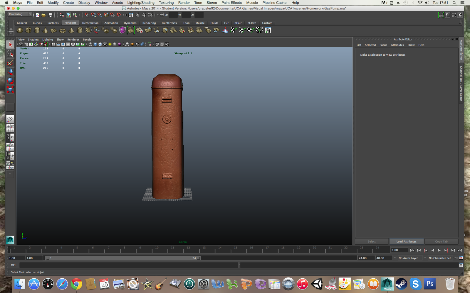
Here is my gas pump model and uv unwrap. I found the tutorials very useful and I feel I'm making progress in developing my 3D art skills. I found modelling the gas pump very simple and completed it very quickly.


I felt I could of done better on unwrapping the model as I had to modify the unwrap a couple of times during the texturing process as Some faces were in the wrong section or not to scale. I also felt I should take more time on the texturing as although the final result looks fine it could look a lot better with more care.


Unity Level: Scripting 1

10/11/2014

Scripting 1

Over the past couple of weeks I have added colour and lighting to my level as well as adding animation to the doors. I removed the default directional light so that my level remains dark and mysterious. I placed several point lights to create a lightbulb lighting effect.


I've also attempted at scripting by using previous scripts from class and tweeking them for my own project. I've added scripts for my elevator doors and for my lighting in the hallway. However both scripts are failing to function properly. I believe my triggers are the key to the problem, but I'm still not sure on the solution. I will continue to research scripting techniques and to try and solve the problem as quickly as possible.


Friday, 7 November 2014

speed painting

07/11/2014

Speed Painting


Here is my attempt at speed painting this week in visual design. I spent two hours on this piece to see how much I can accomplish. This was my first ever attempt at speed painting and i'm pleased with the results. I feel i was able to tackle more important elements such as tone and lighting rather than the little details such as facial and costume designs. Doing this exercise has showed me how important it is to create the lighting and tones first before anything else in an image. I will continue to use this method in the future for more of my work.

Monday, 3 November 2014

Visual design: Halloween

2/11/2014

Halloween

This week I had to design a scary creature of my choosing in the spirit of halloween. I decided to research into demon ghosts specifically female ghosts as they terrify me the most. I can use my fears to an advantage as I can portray my fears and emotions into my work.

I researched many Films and games such as The Ring, Paranormal activity and The Evil Within. What these films and games have in common are that their demon ghosts have their dark long hair covering the majority of their face. I also researched into dementors as they have a very unique style and portrayal of demonic spirits.


I did rough sketches of my demonic female ghost and quickly getting a feel of what design I would go for in my final piece.


I decided to have my demonic spirit leap out from a wardrobe as I feel this adds to the creepiness to the design as well as emphasise the creature leaping forwards.  I need to improve my tones and shadows as well as my texture details. I feel these three elements are lacking in my 2D arsenal and with plenty of study in these areas I will drastically improve my artwork.